Components
The components of your project are the functional pieces of your game. They are the cards, boards, pawns, tokens, etc. that are used to play.
Click Create on the components list page and select a component type to create a new component.
Faces
A face is a "side" of a component. For example, a card has 2 faces, a die has at least 4 faces, and a board has just 1 face.
Click a face in the faces list to go to the Component Editor and design the visual appearance of the face.
Regions
Each face is divided into several regions. A region is a box that has several properties that define its appearance. Some of these properties can be linked to fields in a linked data sheet to customize the text, color, images, etc. that appear on each instance of the component. See Data Sheets for more information on how to link a data sheet to your project.
Component Editor
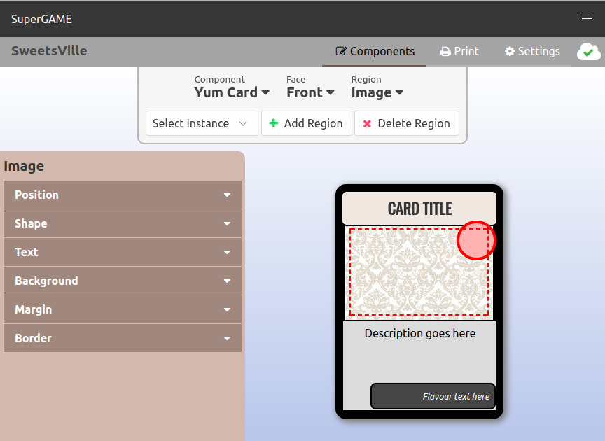
The component editor is where you design the faces of your component.
Use the navigation panel at the top to:
- Select and rename the component
- Select and rename the face
- Select, rename, or re-order regions
- Add a new region
- Delete the selected region
- Link a data sheet (if one is not yet linked — see Data Sheets)
- Choose a component instance to preview the face with real data
Linking Data Sheet Fields
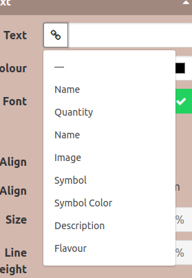
Linking a data sheet to the project (see Data Sheets) allows you to set which spreadsheet field corresponds to a region property. Any region property in the editor that has the 🔗 (link) icon may be linked to a field in your data sheet. Click the link icon to see a list of possible fields for the component.
Previewing Component Data
Select an instance in the top panel to preview what your component will look like with the content from the linked data sheet.
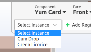
This can be useful to check image sizing, text styling, color design or any other aspect of the component's design that changes for each instance.
Region Properties
The properties panel (on the left side of the page) appears when a region is selected. Use the controls in this panel to alter the region.
Position
- X/Y — Change the position of the region
- Lock — Prevent further changes to the region's position
Shape
- Width/Height — Change the size of the region
- Corners — Change the radius of the region's corners. Tip: Create a circle by setting the corners larger than the region
- Opacity — Make the entire region translucent
- Rotate — Rotate the region
Text
- Text — The text of the region
- Colour — The colour of the text
- Font — Enter a Google Web Font name (case sensitive!) (FUTURE: upload custom fonts)
- H/V Align — Change the horizontal and vertical text alignment
- Size — Change the text size
- Line Height — Change the height of each line of text
Background
- Colour — Change the background colour of the region
- Image — Enter the URL of an image to use a picture for the region background (FUTURE: upload images and create an image library)
- Fill — Change how the image fills the region
- Repeat — Change how the image repeats when Fill is "default"
- Position — Change the position of the image when Fill is "default"
- Mask — Change the mask colour for black and white images (known issue: does not work in all browsers or printing)
Margin
- Top/Left/Bottom/Right — Change the text margins of the region
Border
- Width — Change the size of the region border. Set to 0 to remove the border
- Colour — Change the border colour
- Style — Change the style of the border